In 2016, your resolution should be to update your website

Every five to ten years in the ever evolving world of website design, we see a dramatic shift in website design trends, and the systems and technologies that support them. Even looking back to 2007, many websites were still built using Adobe Flash. But Steve Jobs significantly altered website design with the introduction of the iPhone, which instantly registered many of those websites built on Flash defunct. Overnight, website design had changed once again. And the continued prevalence, and subsequent explosion, of mobile devices and tablets hitting the market, has continued to shape the form and factor of websites ever since. We find ourselves once again at one of those historical points in website design where the perfect storm has formed. It’s time to refresh not just your website design, but maybe even the system you’re using to run your website.
Why? Because google
Around 2011-2012, Google began taking some major steps to increase the effectiveness in the search results people were looking for. Back in those days, you didn’t need to have a very useful or well thought out site. If you paid a company to create a huge amount of links to your site, it didn’t matter how well you answered the questions people were looking for, or how well you presented that information. As long as you had a bunch of links, and flooded your page with the keyword you wanted to rank for, you could gain those first page Google rankings fairly easy, provided you had the money to pay one of these old school SEO firms. Google decided they’d had enough. This wasn’t the vision they had for their prized search engine. They didn’t want it to be a system that could be gamed, and decided to something about it. The challenge before them was twofold:
- They had to continue to rely on links from other sites as a method of democratizing the results (more links indicated the value/popularity of a site, and typically gave higher rankings), but this needed to be configured in such a way that easily attainable links didn’t count.
- Poor content, (usually stuffed excessively with keywords to a point where it became painful to read) written solely with the purpose of ranking, and not giving thought to whether that information was actually of use to the searchers would have to be discounted in some way as well.
To answer these needs, they introduced two very powerful algorithms into the search system. They were called Penguin and Panda. Penguin discovered sites that were obtaining spammy, unnatural links, and penalized the sites, while Panda, looked at the actual design and content you were providing on the site. If the layout/design/content was poorly done, you would just not rank as well as other sites. So there’s a little history lesson. Those algorithms are still very much in effect and some site owners are only now experiencing their impact.
Google and the mobile grail
Much like the Knights That Say Ni, it seems that Google can only say “Mobile” recently. Much like how Panda and Penguin were aimed to help people find what they needed when using Search, Google adapted as more and more people were searching from their phones. But as of late 2015, the mobile experience was still very sub-optimal.
Let’s have a look at an example to see something a little more tangible. In this first image, we see a before and after of a recent site we redesigned. The old on the left, the new on the right. The design on the left seems a bit outdated, but it’s a functional website that got its point across. The design on the right gives it a fresh face. More modern, clean lines, contemporary color palette, etc. It still achieves the intent of the site, but with a cleaner, more polished look than it had in 2012, when the older site was designed.

Looking at the two sites now as they would appear on an iPhone or other smart phone, you can see that the text on the original site is so small you can’t read it. Of course you can zoom into it (Apple did an amazing job with the tap to zoom feature when the iPhone first came out), but even then, some websites leave you squinting to read text styled on the smaller size. You’ll notice the design simplifies quite a bit as well. This is a tremendous help for mobile users that are usually scanning through a site to gain a certain piece of information quickly. Usually while walking, buying coffee (and despite the illegality, operating a car or some other heavy machinery. Please stop doing that, btw).
The rewards of responsive
The examples on the above right images were designed in a way that Responds to the screen size it’s being displayed on, and has been coined “Responsive.” Some people call this Mobile Friendly, but there is a technical distinction. Suffice it to say Responsively designed websites are superior in most cases as the HTML stays the same. Not only does having a Responsive designed website make it easier for the people reading it on their phones, etc. It gets you in Google’s good graces. Yes, again it comes back to Google. …Always with the Google.Early in 20015, Google announced that if your site wasn’t Responsive, or at the very least Mobile Friendly, it would simply prevent your website from being listed in the search results when searched from Mobile! By keeping your site non-accessible to mobile, you lose customers!
The critical nature of keeping current
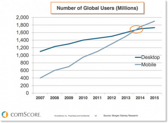
Being a website owner has never been an easy job. As mentioned at the beginning, things change every few years. And we’re at one of those points. Design sensibilities have changed, best practices for search engines have changed, even the way people use your websites have changed. Website design has moved towards the more contemporary, utilizing the full width of the screen of any device they’re displayed on, from the smallest of phones, up to the largest widescreen monitors. The technologies that drive the websites have all evolved too. What used to require Adobe Flash, can now be accomplished with Javascript and jQuery which are compatible with the phones and mobile devices out there. In addition, the combination of HTML5 and CSS3 allow for richer website designs. Mobile is also an area that is increasingly advancing in technology and usage. In 2014, for the first time, people were using mobile more than desktop computers. This means that your website must be usable on phones and tablets. Have a look at this chart from Comscore:
And with article titles like :”Shopping goes mobile – Mobile shopping spiked 60 percent this year.” and “Story of the 2015 Holiday Season: Mobile is Eating Brick-And-Mortar Retail.” It’s critical that we start to think more about how powerful these little devices we carry around in our pockets are, and how we can leverage that for our businesses.
Local businesses see the biggest impact
It’s the unfortunate nature of small businesses being small that result in margins being tight,, and employee paychecks come before marketing and website budgets. To many of those businesses, it’s been a luxury to get to eventually, as opposed to something that can expand and grow the business far greater than just walk-in traffic and word of mouth. If there has ever been a time to obtain a website, and one that plays nice with mobile devices, it’s now. Let’s have a look at a few reasons:
- As pointed out in the previous section, mobile device usage has surpassed desktop when it comes to searches.
- Those searches are usually in regards to local businesses and such questions as: where are they, what are their hours, what do they serve, what do other people think, etc.
- Your clientele is increasingly becoming made up of members of the Millennial generation. You know the kids who never look up from their phone? Yep, that’s them.
- Those people who are searching for you have short attention spans and little patience. You could very well be losing customers over something as simple as not having your menu on your website.
WordPress to the rescue
Despite the complexities of owning a website, it’s less expensive now to have a website created than it has ever been. A number of solutions have taken simple website creation from tens of thousands of dollars to thousands (or even hundreds of dollars for those who want to go the DIY route).
WordPress is probably the most popular solution for small businesses. It offers power, flexibility and ease of use. You can now purchase pre-made themes for your WordPress site for less than $100. And the theme designers understand the importance of Responsive design.
It is important to know that with a pre-made theme, there may not be a ton of flexibility. After all $100 is a tremendously small amount of money to spend on a website, while hiring a designer or developer could run in the thousands to tens of thousands. So keep in mind the level of quality you’re getting with a theme. Remember the saying “You get what you pay for.”
If you need something a bit more robust, or you’re not comfortable with the DIY approach, we recommend hiring a designer/developer to help you accomplish it.
But whether you do it yourself, or hire a developer to help you with it, the technology and cost available to you, is better than it’s ever been in the history of web development.
Software & security
The software that drives websites now can become outdated if you’re not paying attention. This leaves you susceptible to security risks. Each time WordPress updates the core software, it is improving its security infrastructure. If you fall too far behind, hackers can find out how to exploit old security issues and do things to your site like turn it into their own online Viagra store.
If you’re on an older version of WordPress or worse, Joomla. It’s critical that you get upgraded. If your site hasn’t already been hacked, it’s likely to happen any nano-second.
The time is now
To sum, we find ourselves at a nexus point in website design and technology where it’s critical that we reexamine our websites, how they’re run, the design and how effective they are for the end user, your clients and potential clients. For the following reasons and more, you should be looking at 2016 as the year to give your website a facelift.
- Design aesthetics have changed significantly.
- How people use websites have altered.
- Search Engine’s propensity towards mobile and accessible websites
- The momentous increase in mobile usage
- Ease and flexibility of WordPress
- Security issues with older CMS versions like Joomla
If you have any questions, or are looking for someone to guide you through that process, we’re here to help you with that.